TextToolkit
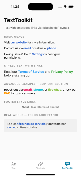
The TextToolkit component allows you to embed multiple links within text using {placeholder} syntax. It accepts all Text props for styling the text segments, while links maintain their own independent styles.
Basic Usage
tsx
import { TextToolkit } from '@nolasco7a/react-native-text-toolkit';

// Simple link
<TextToolkit
  text="Visit {website} for more information."
  links={{
    website: { text: "our website", type: "url", value: "https://example.com" }
  }}
/>

// Multiple links
<TextToolkit
  text="Contact us via {email} or call us at {phone}."
  links={{
    email: { text: "email", type: "email", value: "support@example.com" },
    phone: { text: "phone", type: "phone", value: "+1234567890" }
  }}
/>

// Settings link in text
<TextToolkit
  text="Having issues? Go to {settings} to configure permissions."
  links={{
    settings: { text: "Settings", type: "settings" }
  }}
/>
Styled Text with Links
tsx
<TextToolkit
  text="Read our {terms} and {privacy} before signing up."
  style={{ fontSize: 16, color: "#333" }}
  themeTextColors={{ light: "#333", dark: "#CCC" }}
  links={{
    terms: {
      text: "Terms of Service",
      type: "url",
      value: "https://example.com/terms",
      style: { color: "#2196F3" }
    },
    privacy: {
      text: "Privacy Policy",
      type: "url",
      value: "https://example.com/privacy",
      style: { color: "#4CAF50" }
    }
  }}
/>
Advanced Example — Support Section
tsx
<TextToolkit
  text="Reach out via {email}, {phone}, or {chat}. Check our {faq} for quick answers."
  style={{ fontSize: 15 }}
  links={{
    email: {
      text: "email",
      type: "email",
      value: "support@example.com",
      style: { color: "#E91E63", fontWeight: "800" }
    },
    phone: {
      text: "phone",
      type: "phone",
      value: "+1234567890",
      style: { color: "#00BCD4", fontWeight: "800" }
    },
    chat: {
      text: "live chat",
      type: "url",
      value: "https://example.com/chat",
      style: { color: "#8BC34A", fontWeight: "800" }
    },
    faq: {
      text: "FAQ",
      type: "url",
      value: "https://example.com/faq",
      style: { color: "#FF9800", fontWeight: "800" }
    }
  }}
/>
Footer Style Links
tsx
<TextToolkit
  text="{about} | {blog} | {careers} | {contact}"
  style={{ fontSize: 12, textAlign: "center" }}
  links={{
    about: {
      text: "About",
      type: "url",
      value: "https://example.com/about",
      style: { color: "#757575", fontSize: 12, textDecorationLine: "none" }
    },
    blog: {
      text: "Blog",
      type: "url",
      value: "https://example.com/blog",
      style: { color: "#757575", fontSize: 12, textDecorationLine: "none" }
    },
    careers: {
      text: "Careers",
      type: "url",
      value: "https://example.com/careers",
      style: { color: "#757575", fontSize: 12, textDecorationLine: "none" }
    },
    contact: {
      text: "Contact",
      type: "url",
      value: "https://example.com/contact",
      style: { color: "#757575", fontSize: 12, textDecorationLine: "none" }
    }
  }}
/>
Props
Accepts all Text props (except text and onPress) plus:
| Prop | Type | Description |
|---|---|---|
text | string | Text with {placeholder} tags for links |
links | LinksMapping | Object mapping placeholder names to link configurations |
style | StyleProp<TextStyle> | Styles applied to all text segments |
themeTextColors | { light: ColorValue, dark: ColorValue } | Theme-aware colors for text segments |
LinksMapping
Each key in the links object corresponds to a placeholder in the text. The value is a TextLinkProps object:
ts
{
  [placeholderName: string]: {
    text: string;                  // Display text for the link
    type: "url" | "email" | "phone" | "sms" | "settings";
    value?: string;                // Link value (not required for "settings")
    style?: StyleProp<TextStyle>;  // Optional custom styling
  }
}