Text
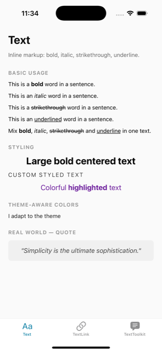
The Text component supports inline markup using a simple syntax:
| Style | Syntax | Example |
|---|---|---|
| Bold | {**text**} | {**bold**} |
| Italic | {!!text!!} | {!!italic!!} |
{~~text~~} | {~~deleted~~} | |
| Underline | {__text__} | {__important__} |
Basic Usage
tsx
import { Text } from '@nolasco7a/react-native-text-toolkit';

// Bold text
<Text text="This is a {**bold**} word in a sentence." />

// Italic text
<Text text="This is an {!!italic!!} word in a sentence." />

// Strikethrough text
<Text text="This is a {~~strikethrough~~} word in a sentence." />

// Underline text
<Text text="This is an {__underlined__} word in a sentence." />

// Combining multiple styles
<Text text="Mix {**bold**}, {!!italic!!}, {~~strikethrough~~} and {__underline__} in one text." />
Styling
All styling is done through React Native's standard style prop. No arbitrary presets — you have full control.
tsx
<Text
  text="Large bold centered text"
  style={{ fontSize: 24, fontWeight: "bold", textAlign: "center" }}
/>

<Text
  text="Custom styled text"
  style={{ fontSize: 14, fontWeight: "300", textTransform: "uppercase", letterSpacing: 2 }}
/>
Theme-aware Colors
Automatically adapts text color based on the device's color scheme using useColorScheme().
tsx
<Text
  text="I adapt to the theme"
  themeTextColors={{ light: "#222222", dark: "#EEEEEE" }}
/>
Without themeTextColors, the text defaults to #000000 in light mode and #FFFFFF in dark mode.
Props
| Prop | Type | Default | Description |
|---|---|---|---|
text | string | React.ReactNode | - | The text to display |
style | StyleProp<TextStyle> | - | Standard React Native text styles |
onPress | () => void | - | Press handler |
themeTextColors | { light: ColorValue, dark: ColorValue } | { light: "#000000", dark: "#FFFFFF" } | Theme-aware colors |